Creating epidemic models in javascript
Idea
I recently helped run a workshop on an introduction to epidemic modelling and wanted
to build a simple spatial epidemic model to allow people to explore concepts
such as vaccination and the \(R_0\) or basic reproduction number. Having built other
models in javascript using d3.js this felt like a natural choice for me. If
you just want to skip to the end, the finished product can be found here.
d3 is a fantastic library for doing data visualization. According to their website:
D3.js is a JavaScript library for manipulating documents based on data. D3 helps you bring data to life using HTML, SVG and CSS. D3’s emphasis on web standards gives you the full capabilities of modern browsers without tying yourself to a proprietary framework, combining powerful visualization components and a data-driven approach to DOM manipulation.
On top of this I also used Plotly.js to do the actual graphing. This is an open-source javascript library built on top of d3 with a simple to use API that can quickly give you some good results.
Also I won’t be covering the basics of d3, but would recommend checking out this tutorial.
Implementation
For the main epidemic I wanted to display individuals as circles on a grid that were colored according to their corresponding infection status (e.g. red for infected). The infection can only spread locally, so within a time-step there is some probability that a susceptible neighbour of an infected individual becomes infected. There is also a probability that an individual recovers after an infection at which point their removed from the epidemic and can no longer become infectious again.
I found a library for d3 called d3.grid.js that seemed to fit the bill in terms of displaying the nodes on a grid.
The github can be found here.
Let’s begin with defining the grid size, colors we’ll use, epidemic parameters and a variable to control when the simulation is running.
var w = d3.select('#lattice-epidemic-tool').node().getBoundingClientRect().width/2,
    h = w,
    eps = 0.01,
    N = 20;
var blue = d3.rgb(100,100,200),
    red = d3.rgb(200,100,100),
    //green = d3.rgb(100,200,100);
    green = d3.rgb(200,200,200);
var grid = d3.layout.grid()
  .nodeSize([h*0.8/(N*2), h*0.8/(N*2)])
  .padding([h*0.8/(N*2), h*0.8/(N*2)]);
var beta = eps*1,
    gamma = eps*0.5;

var nodes = [];
var force,root,svg,button;
var pause = false;
Next we define the traces of the graph used by Plotly:
var traceS = {
  x: [],
  y: [],
  name: 'Susceptible',
  type: 'scatter'
};

var traceI = {
  x: [],
  y: [],
  name: 'Infected',
  type: 'scatter'
};
var t = 0;
var data = [traceS, traceI];
As you can see the API is fairly straightforward. We’ll fill in the x and y data variables later when the model starts. Let’s make a function that resets this graph
function resetGraph(){
  traceS = {
    x: [],
    y: [],
    name: 'Susceptible',
    type: 'scatter'
  };
  traceI = {
    x: [],
    y: [],
    name: 'Infected',
    type: 'scatter'
  };
  t = 0;
  data = [traceS, traceI];
  Plotly.newPlot('graphDiv', data);
}

Plotly.newPlot('graphDiv', data);
We call the newPlot method at the end to instantiate the graph in the div with id graphDiv.
Now we get into starting up the simulation including using the grid layout I discussed above. We also want to have
a variable pause, so we can click to stop the simulation and inspect it before continuing. Each node represents
an individual and is given two properties: infected or immune. If an individual is infected then any of their
neighbours can become infected in one time-step if they are not already infected or not immune.
I also added a feature where you can click on individuals to vaccinate them or make them immune.
function startSim(){
  pause = false;
  resetGraph();
  d3.select("svg").remove();
  svg = d3.select("#epidemic").append("svg:svg")
      .attr("width", w)
      .attr("height", h);


  nodes = d3.range(N*N).map(function() { return {radius: h*0.8/(N*2), infected: Math.random()<0.01, immune:false}; });


      svg.selectAll("circle")
          .data(grid(nodes), function(d) { return d.id; })
        .enter().append("svg:circle")
          .attr("transform", function(d) { return "translate(" + (d.x+w/20) + "," + (d.y+h/20) + ")"; })
          .attr("r", function(d) { return d.radius; })
          .attr("id",function(d,i) {return 'individual-'+i;})
          .style("fill", function(d, i) { return blue; })
          .on("click", function(d,i){

                     d.radius=20;
                     d3.select(this).attr('stroke','black');
                     nodes[i].immune = true;

                 });
  }
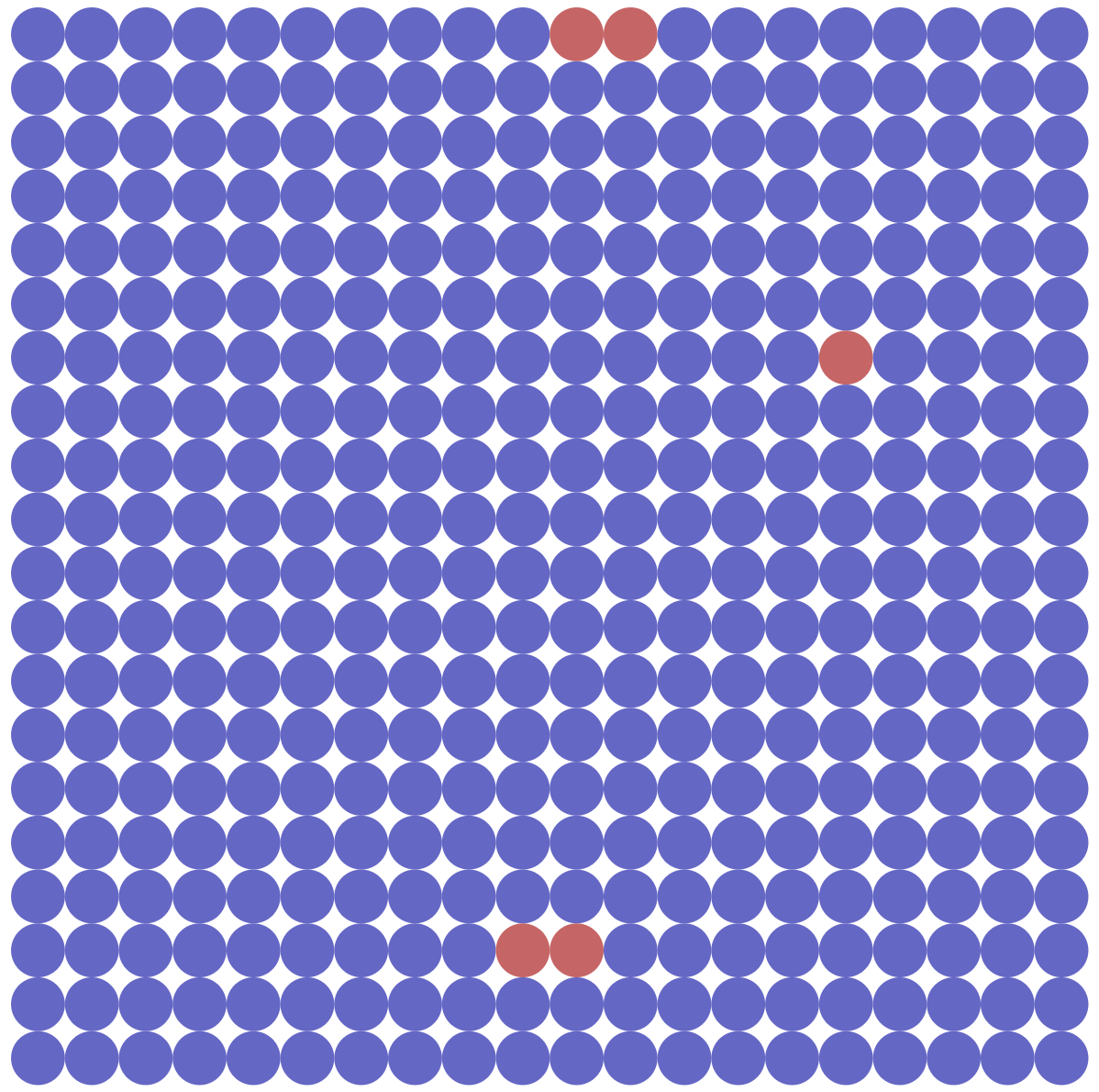
The starting grid should look something like this:
Next, we define the functionality for the pause and reset buttons and start the simulation.
$('#pause').on('click',function(){
  pause = !pause;
});
$('#reset').on('click',startSim);
startSim();
As the nodes aren’t indexed according to where they are in the grid we’ll need
some way of mapping their index to the index on the grid so we can calculate its
neighbors. latticeNeighbors returns an array of neighbours on the grid from a node’s index
and indNeighbours converts those back into their indices.
latticeNeighbors = function(ind,N){
  /*
  Takes in index and calculates where in the lattice it is
  2. calculates its neighbors.
     - first calculate left,right,up,down
     - next check if these are outside the boundary if so discard.
  3. converts these neighbors back into a lattice form.
  lattice indexes 0,...,N-1 by 0,...,N-1
  */
  var i = Math.floor(ind/N), j = (ind%N);
  neighbors =[];
  if (i-1>=0){ neighbors.push([i-1,j]); } //left
  if (i+1<N){  neighbors.push([i+1,j]); }//right
  if (j+1<N){  neighbors.push([i,j+1]); } //up
  if (j-1>=0){ neighbors.push([i,j-1]); } //down
  neighbors.map(function(item,index){ //convert back into index.
    return N*item[0] + item[1];
  });
  return neighbors;
}
indNeighbors = function(ind,N){
  var inds = latticeNeighbors(ind,N).map(function(item,index){ //convert back into index.
                                            return N*item[0] + item[1];
                                          });
  return inds
}
Now we can get to the actual simulation part. We use an interval to update the model in discrete time. We also keep track of the number of infected and susceptible individuals. Infected and recovered individuals change randomly according to their status and their neighbors statuses. finally the colours indicating someone’s status are updated.
/*Run simulation of epidemic every second. */
setInterval(function () {
  if(!pause){
    var i = 0,
        n = nodes.length,
        I = 0,
        S = 0;
    for(var j = 0; j<n; j++){
      I += nodes[j].infected & !nodes[j].immune;
      S += !nodes[j].infected & !nodes[j].immune;
    }
    t += eps;
    if(!(I==0 || S ==0)){
      data[0].x.push(t); data[0].y.push(S);
      data[1].x.push(t); data[1].y.push(I);
      Plotly.redraw('graphDiv');
    }
    for(i = 0; i<n; i++){
      if(nodes[i].infected){

        var neighbors = indNeighbors(i,N);
        for(var ni = 0; ni<neighbors.length; ni++){
          if (Math.random()<beta & !nodes[neighbors[ni]].immune){
            nodes[neighbors[ni]].infected = true;
          }
        }

        if (Math.random()<gamma){
          nodes[i].infected = false;
          nodes[i].immune = true;
        }

      }
    }
    svg.selectAll("circle").style("fill", function(d,i) {
                                                          var col = blue;
                                                          if (nodes[i].infected & !nodes.immune ){
                                                            col = red;
                                                          }
                                                          if(nodes[i].immune){
                                                            col = green;
                                                          }
                                                          return col;
                                                        });

    if(I == 0 || S == 0){

      button.style("visibility", "visible");
    }
  }
}, 100);
The last bit is to create some sliders to control key parameters for the model. Instead of using the infection and recovery rate, I implemented a slider for the basic reproduction number and the speed of the simulation. The basic reproduction number isn’t actually correct (play around with it and see for yourself), but it’s an approximation that works well enough. Here I’m using a library called bootstrap-slider
$('#ex1').slider({
	formatter: function(value) {
		return 'Current value: ' + value;
	}
}).on('slide',function(slideEvt){
  beta = slideEvt.value*gamma;
});

$('#ex2').slider({
	formatter: function(value) {
		return 'Current value: ' + value;
	}
}).on('slide',function(slideEvt){
  eps = slideEvt.value;
  var R = beta/gamma;
  beta = R*eps;
  gamma = eps;
});
Extension
There’s probably a few interesting features we can add. We can try adding a parameter that controls how much infection spreads locally compared to how it spreads globally (might need to adjust the \(R_0\) in this case). We can add a way of setting up the model to include individuals with prior immunity and who are already infectious. Or how about a more complex epidemic with an exposed class, or maybe have individuals with varying infectiousness? Seems like it would be a good framework to explore lots of interesting math epi concepts. Play around with it and see what ideas you come up with. Once again, the end-result can be found here.