Presenting & Communicating models: Creating online web applications
This blog came about from a recently published article I had in PLoS NTD that I also recently gave as a talk. The main idea is that it’s becoming increasingly easy to create front-ends or dashboards for an epidemic model or models in general and so to lay out some of the tools that we could potentially utilise. Creating a dashboard for a model comes with its own set of challenges and questions: how much can a user play around with the model? what should be outputted and in what format? how can you easily show what’s going into the model?
These are difficult questions to answer and would certainly be answered differently on a case by case basis. We tried laying out in the article and here some of the things that need to be considered on a conceptual level and some of the advantages and disadvantages to this approach. Finally I go through a few different technologies for generating a modelling tool and then talk through some examples.
Challenges in communicating models
Developing user friendly interfaces we probably want to consider the following:
- Access—for users with limited modelling expertise.
- Speed—analyses produced quickly without expensive computer resources.
- Characterisation of uncertainty—usually through repeated runs of the model, resulting in a higher processing burden.
- Ease of use—requires design choices, including instructive inputs.
- Clarity of presentation—limiting misunderstanding of the model and its outputs.
- Responsiveness to needs—flexibility to iteratively update the interface through a consultation with intended end-users.
- Range of users—different users have different needs, and it is challenging to survey and understand all of these needs.
Advantages & disadvantages for a web interface
The main advantage is that it can give access to the model for non-expert users. They are also able to generate results from the model in real-time using their own processing power. Interactive input and output can be tailored directly to disease-specific goals, such as seeing what impact increasing the coverage of a vaccine has.
There are some things to consider however. There could be potential misinterpretation or misuse of results due to lack of expert guidance; for example, the dynamics of breaking transmission are likely to be highly locally specific and the modeling results should considered in this context. Part of this means that limited parameters can be changed in the model and end-users don’t have full access to model through interface. This also means it is limited either tailoring to local settings or can only deal with very generic and perhaps unrealistic scenarios.
Can a browser really run complex model simulations?
The short answer is yes! The Second Browser War lead to development of Google’s V8 engine in 2011. Other browsers followed in suit and now most browsers can run standard ECMAscript. There is also an increasing trend in single page applications shifting computation from server to client, meaning more libraries and tools are available with this in mind.
Some examples include
- Neural networks: Tensorflow, ConvNetjs
- Particle simulator: LiquidFun
- PDE, ODE solvers: numericjs
- 3d simulations
- Many more…
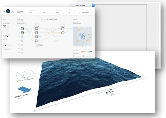
Potential web interface technologies
Now we’ve established what we can do in a browser we can look at some of the technologies currently available.
Shiny
Shiny is a way of writing apps in the statistical
language R. It’s becoming an increasingly popular
way of creating a modelling dashboard and is under active development so there’ll
be lots of new features being added. If the model’s already written in R then
it should be easy to implement something quickly.
Python jupyter notebook
jupyter notebooks are another viable option for developing a simple dashboard. Again, this doesn’t require an explicit knowledge of web technologies although they become helpful for more complex tasks. They’re extremely easy to set up and host on somewhere like Github and are great for quickly displaying concepts and creating tutorials/blog posts. As with Shiny, there comes a limit where you won’t be able to accomplish everything that you’d want to do however when trying to create tools for more complex models.
Native JavaScript
As with all other libraries or APIs that provide a way of generating a website
or tool, at some point you’re going to want to do something that has been
explicitly accounted for by the framework. It’s worth considering creating something
in more native javascript therefore, although this is going to require some
degree of knowledge of web development (CSS,HTML etc). What you get from this is
access to very powerful libraries for visualisation such as d3.js and
Plotly.js. I’d recommend browsing the d3 gallery to see the range
of interactive graphs and figures it can achieve. Another advantage of going down
the javascript route is providing an easier way of linking to external databases and
other website APIs. As mentioned before browser js engines are powerful and there are
plenty of libraries out there for solving ODEs and PDEs as well as plenty of scope
for writing your own solver libraries.
Although there’s a bit more overhead with something like Shiny you can generate
dashboards using a HTML/CSS library such as Bootstrap.
There also exist lots of example dashboard templates that are often free to use.
Some examples
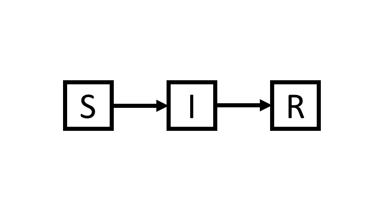
Let’s look at some specific examples written in js, plotly and d3. For these
examples we’ll use the SIR model. This is one of the simplest epidemic models, where
individuals progress through three disease stages: susceptible (\(S\)), infected (\(I\))
and recovered (\(R\)) as in the diagram below
We’ll assume a fixed population where everyone is susceptible except for a couple of infections at the start.
The first example is an individual simulation, with individuals represented as coloured circles with blue denoting susceptible, red denoting infected and gray denoting recovered. We can interact with the simulation as it progresses by clicking on individuals to “vaccinate” them. All other parameters such as the rate of infectivity and the infectious period can’t be adjusted.
Going further into the concept of the SIR, we might want to explore what impact the different parameters have on the dynamics of the infection. Below we simulate a deterministic (ODE or in a very large population) epidemic and explore what impact the basic reproduction number \(R_0\) and the infectious period has. \(R_0\) can be a slightly tricky concept to understand, it’s defined as the average number of secondary cases from one primary case in a completely susceptible population. Notice that if it’s less than one then there’s no chance of an epidemic taking off.
We can also explore this concept using a stochastic as opposed to a deterministic model. Here we simulate the epidemic starting with one infected individual and repeat the simulation multiple times to create a distribution of the epidemic curves.
For a more sophisticated example, although one that uses the same basic principles, go to ntdmodelling.org/transfil for a dashboard to model intervention strategies for lymphatic filariasis (a neglected tropical disease) that we developed.
Conclusion
There are many potential technologies out there to build single-page applications and dashboards
and it’s becoming easier to produce some really powerful, user-friendly tools.
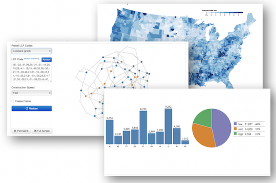
One of the big advantages for having interactive plots is when it comes to geographic data.
This is again where a library like d3 really shines and there are some fantastic examples
out there.
All of these examples can run in browser, which offers a lot of advantages. Users won’t need to install any software, they can store data locally, interact with other website APIs to pull in other data sources and if the application is updated then these a pushed to the user immediately.
Even if the model can’t be coded up in js, having a few interactive plots goes a long way to
explaining complex results and can provide a more succinct way of conveying geographic data.
The original article that inspired this blog is open-access and can be found below.